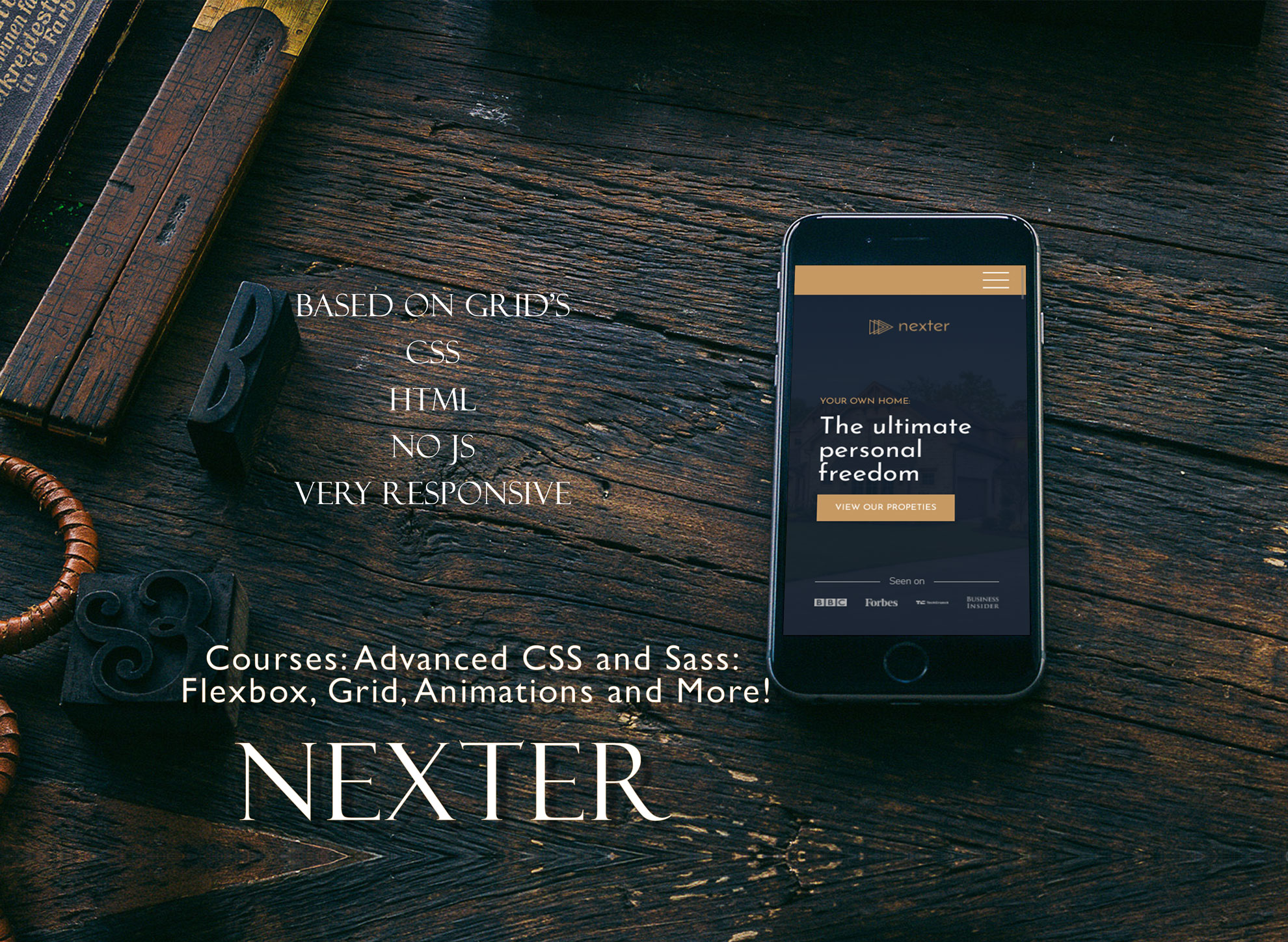
Used:
HTML5 + CSS3 (SCSS)
Implemented:
- Based on CSS GRID's
- Responsive mostly without media queries, responsive by Grid properties
- Very simple animations
- Based on REM and EM, and %
- Based on components
- BEM methodology
- Custom Grid
- SCSS: variables and nesting
- Responsive design
- Adaptive design
- Desktop-first development
- Responsive images
- Browsers support with @support as example
- Some features for supporting browsers
- Optimized for desktop/mobiles (will be added)
- SVG icons (in HTML and CSS)
- No JS
- Development environment for big projects without GULP, only npm packages.